18 October 2021
How to prevent a single word after a line break with CSS
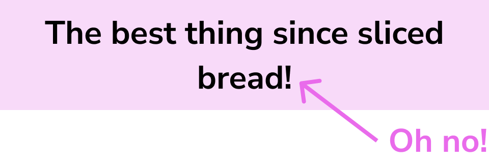
Web pages are marvelous beasts that can be rendered at any pixel width on all sorts of devices. Designs on the other hand tend to be done at 1 or 2 sizes where text is hardcoded and can be placed with exacting precision. As a result, it’s a common scenario to build something that looks…
like this on desktop:

like this on mobile:

and then like this at some in-between browser size:

Usually some sort of dance ensues where the designer asks how to prevent that awkward single-word line break and the engineer says that it’s a responsive design and we can’t account for every potential width for line breaks.
If you dig into CSS options, there’s a morbidly named, but promising sounding feature for “widows & orphans”, but that’s mostly just for column layouts and instructs on whether to have a whole paragraph show in a new section or not.
I’ve been using a solution for this for years with the following CSS class that utilizes the white-space property:
.nowrap {
    white-space: nowrap;
}
And then in any text that I want to target, I just wrap the last two words in a span with this class:
<p>
    The best thing since <span class="nowrap">sliced bread!</span>
</p>
This makes anything inside it stick together and get treated like one word. As long as you’re not putting too much stuff inside it that might overflow its container, then you should be good to go.
You can get more surgical by combining this idea with media queries, but it’s best to keep things as simple as possible until you need something more!